Wells Fargo: Greenhouse
Led Android adaptation of an experimental mobile banking app for underserved consumers—shipping a national launch while building systems that accelerated team delivery.
Role: UX Designer | Duration: 9 months | Team: Cross-functional (~20 people)
Shipped
Android app launched nationally during engagement.
Component Map
iOS-to-Android mapping system accelerated team delivery
ADA Compliant
Ensured accessibility standards across all flows
The mission
57% of Americans struggle financially. 44% can't cover a $400 emergency.
Greenhouse was Wells Fargo's experimental mobile banking app designed to help underserved consumers—those with irregular income, new to banking, or managing money primarily with cash—take control of their finances through simplified, intuitive money management.
The problem
Business context
Greenhouse had proven its value on iOS and was preparing to expand nationally with an Android version. But this wasn't a simple port—the team needed to deliver a native Android experience on an aggressive timeline while working around legacy backend constraints.
The challenge
The client needed more than an iOS replica. They needed:
A native Android experience aligned with Material Design and platform conventions
Delivery on an aggressive national launch timeline
Solutions for technical limitations from legacy backend systems
Full ADA accessibility compliance
Critical insight
Speed wasn't just about working faster—it was about building systems that made the whole team faster. I realized early that if I created a comprehensive iOS-to-Android component mapping, the entire Android team could move more efficiently without constantly cross-referencing or reinventing solutions.
Strategic approach
The iOS-to-Android component mapping system
Rather than having designers repeatedly figure out how to translate iOS patterns, I analyzed the entire iOS app and created a comprehensive mapping system:
Broke down every iOS feature and component into a structured reference list.
Mapped each to its native Android/Material Design equivalent
Created a quick-reference guide for the Android UX team
Enabled faster implementation and consistent decision-making across the team
Key constraints
Aggressive launch timeline
Legacy backend systems with technical limitations
ADA compliance requirements (non-negotiable for a major bank)
Coordination across a ~20-person cross-functional team
Trade-offs and decisions
We had to decide where to stay true to iOS patterns for consistency vs. where to embrace Android conventions. We chose to follow Material Design for navigation and system behaviors (what Android users expect) while keeping the core interaction models for budgeting features.
The solution
Core features
Adapted functionality and user flows for Greenhouse's Android key features:
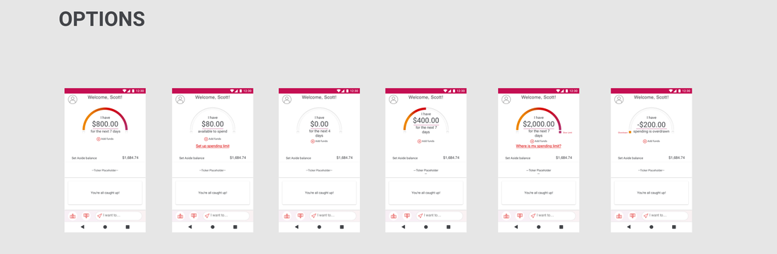
Dual-account budgeting system: Helped users separate spending money from savings, making it easier to avoid overdrafts.
Bill "Envelopes": Virtual envelopes for organizing and tracking recurring expenses.
Real-time spending visualizations: Including the spending gauge, explored redesigns based on usability considerations.
Design improvements over iOS
Kicked off redesign explorations for the spending gauge based on user feedback
Fixed small navigation issues from iOS while adapting to Android convention
Discovery & analysis
Audited the iOS app to identify components requiring adaptation
Analyzed backend behaviors and technical constraints
Reviewed user interviews and transcripts to understand core needs
Planning & architecture
Developed feature maps, and user flows tailored to an Android experience
Identified and addressed areas of ambiguity in backend behavior with the BA/QA teams
Design & prototyping
Created wireframes and prototypes covering all key flows and micro interactions
Delivered detailed design specs supporting accessibility, animation, and interaction design
Used Material Design principles to align the product with Android-native behavior and visual consistency
Produced high-fidelity mockups and visual assets for efficient dev handoff
Collaboration and delivery
Team structure
Collaborated with a cross-functional team of approximately 20 people:
2 designers (Android) + 2 designers (iOS)
2 content designers
10 developers
3-4 product owners
How I enabled delivery
Delivered detailed wireframes, mockups, and documentation for efficient dev handoff
Worked closely with developers to resolve system behavior ambiguities from legacy backend
Partnered with QA to verify behavior matched expectations across devices
Updated style guide and documentation for long-term scalability
Maintained ADA compliance through accessible design specifications
Disclaimer: In my role as a UX consultant under NDA agreements, I'm limited in how much I can visually disclose. While I can't show full-resolution designs or detailed project visuals, I’ve highlighted key insights and outcomes to showcase my thinking and contributions.
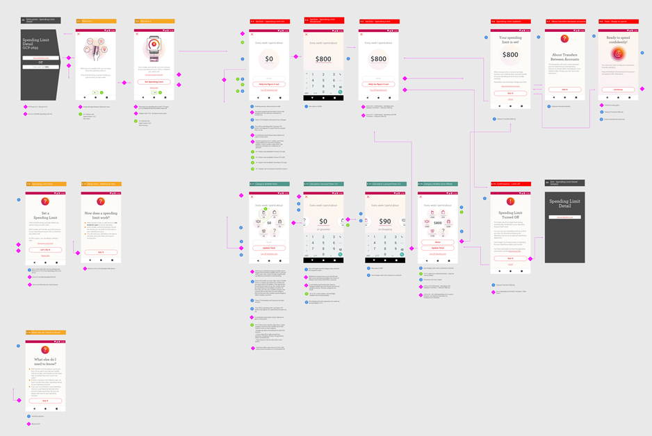
Wireframes with ada, interaction, and user flow annotations

Wireframes with ada, interaction, and user flow annotations
Gauge design explorations

Gauge design explorations
Reflections and learnings
What worked
The component mapping system paid off—it became a reference the team used.
Investing in documentation upfront reduced back-and-forth during development.
Close collaboration with developers helped resolve legacy backend issues before they became blockers.
What I'd do differently
I would have pushed for user research with Android-specific users. We adapted based on iOS research, but Android users may have had different needs or expectations we didn't capture.
How this shaped my growth
This project taught me that efficiency and quality can coexist if you invest in systems that scale. Building the component mapping added time upfront but saved far more across the team. It reinforced that design work is often about creating leverage: making yourself and everyone around you more effective.
Note: Greenhouse was an experimental product. In 2020, Wells Fargo stopped accepting new users and eventually sunset the app. While the product didn't continue, the Android launch was successful during its lifetime, and the work demonstrated how to deliver quality at speed for a mission-driven product.